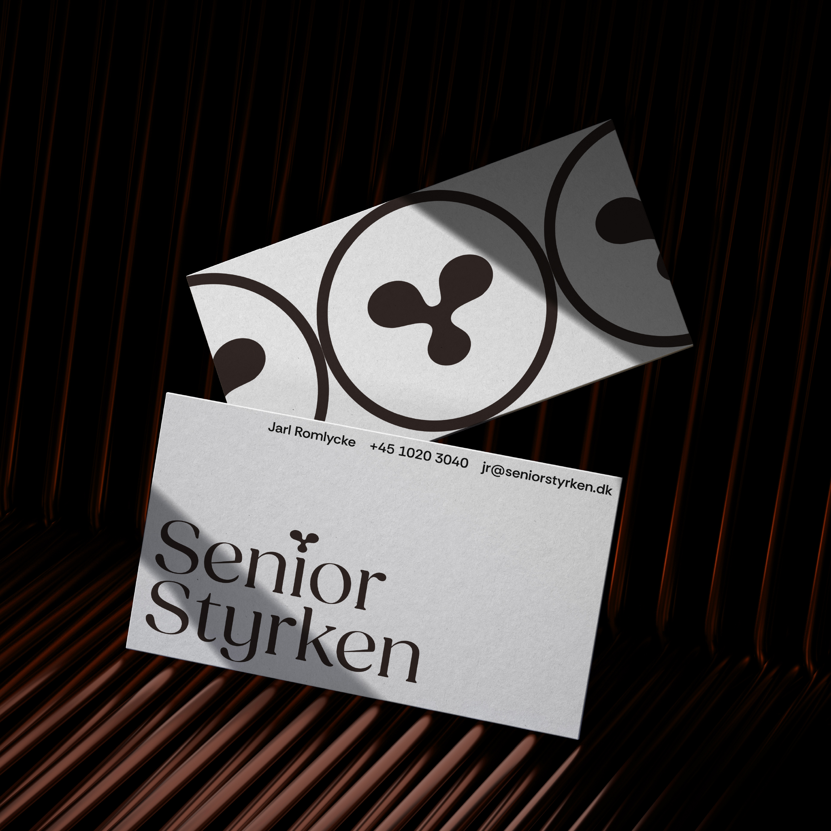
Senior Styrken
Complete rebrand as this senior friendly client enters the Danish market
mature
branding
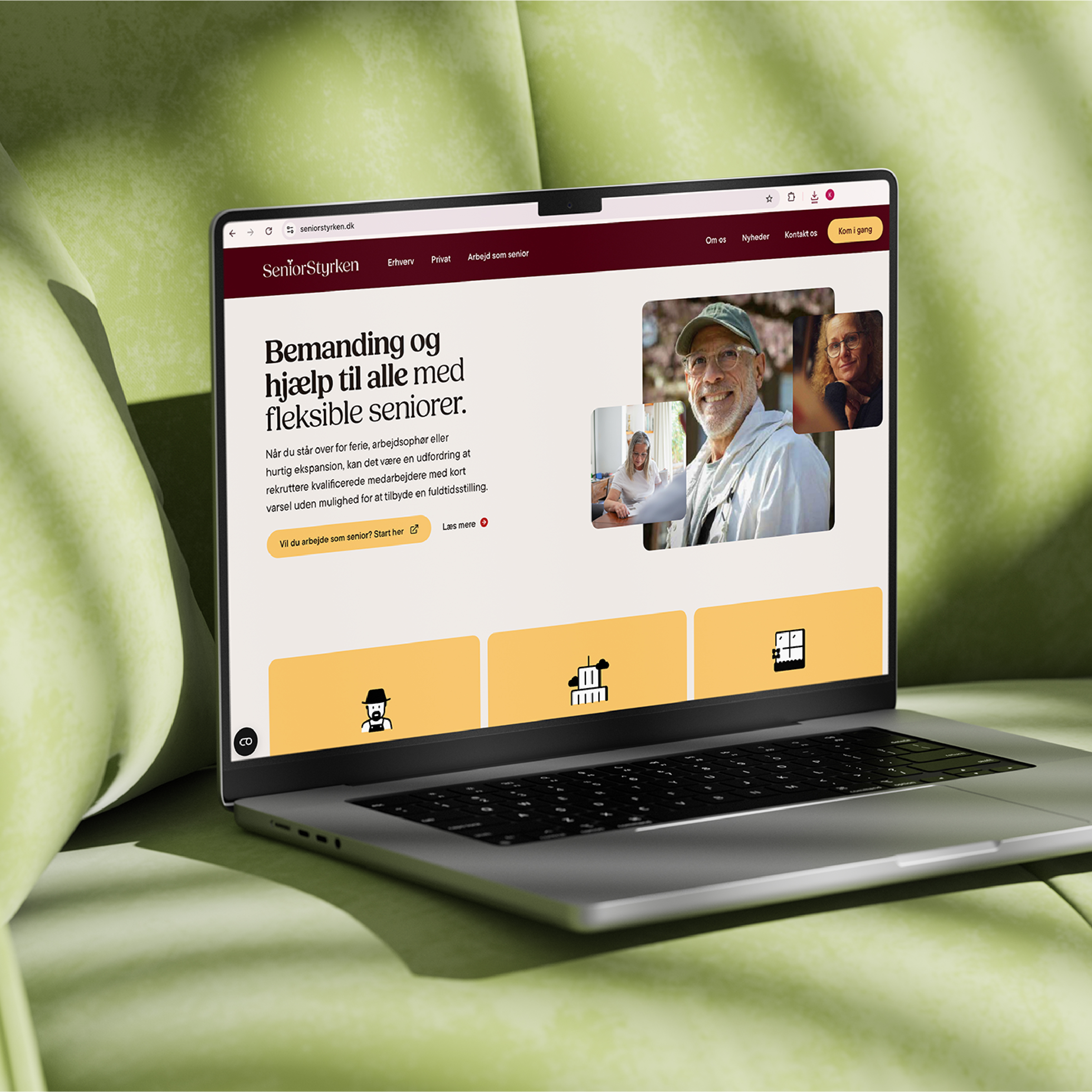
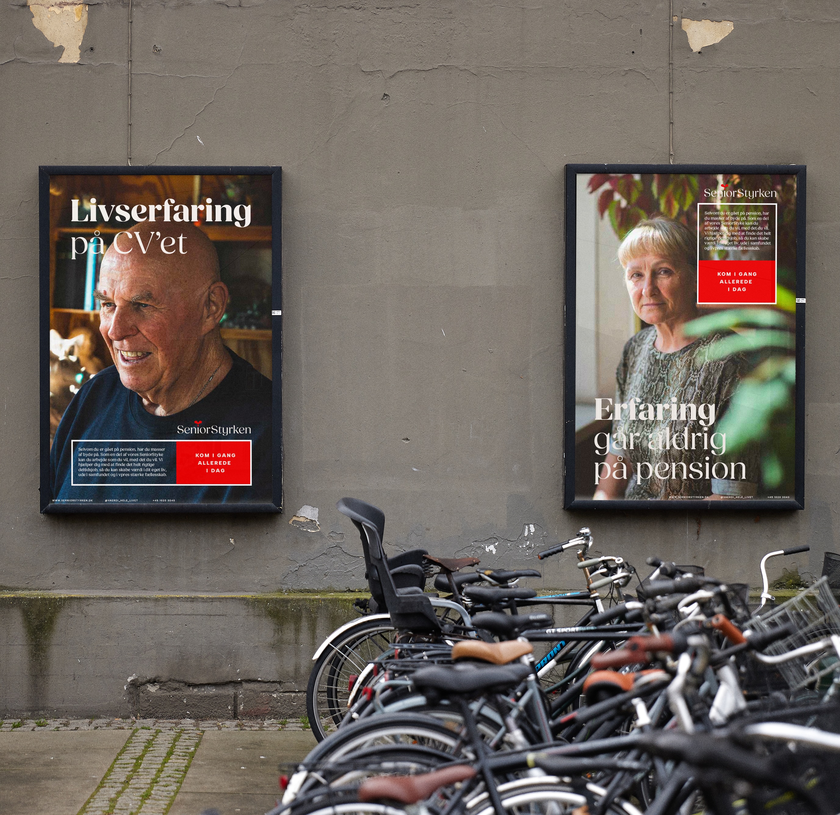
Who do we want to be? How do we want to look? Those were the questions we needed to answer for this rebrand to be a succes, as the Swedish company Veteranpoolen was entering the Danish market.
The task at hand was to find a new name for the Swedish company, a name more appropriate for the Danish market, and build a strong visual branding around this newborn, to make sure the brand would stand out and be remembered by the target audience.
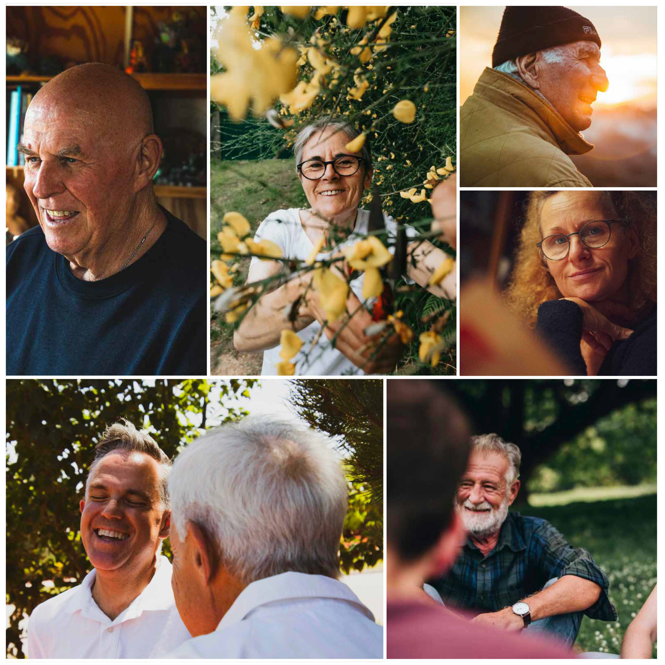
We tested multiple name options in a carefully selected focus group, and as the right one was chosen in collaboration between designer, client and focus group the design process could begin. Once again we called in the focus group and testet several visual styles and directions to ensure that the final design resonated with the audience. The test showed they wanted minimalism, credibility, warmth and humanity.
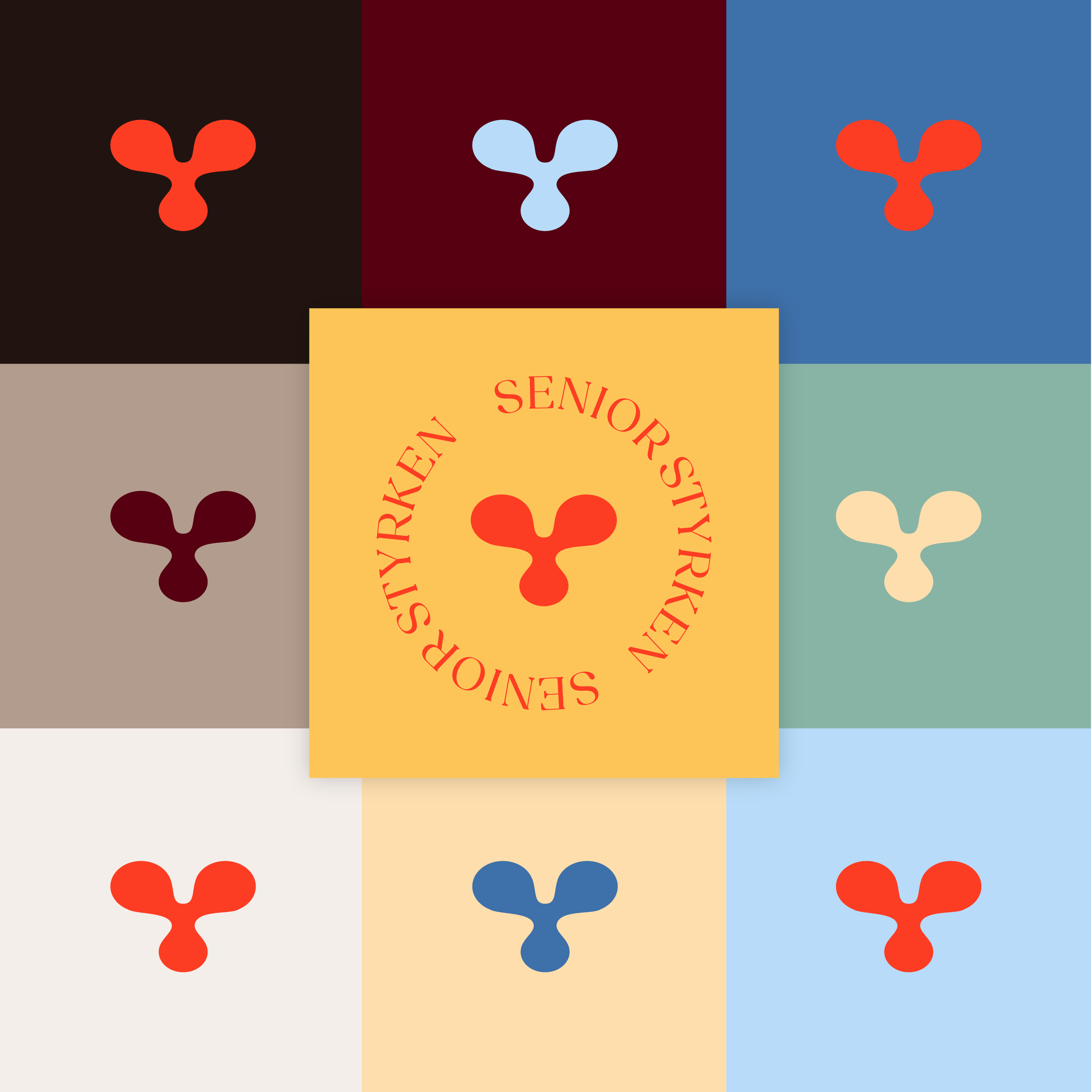
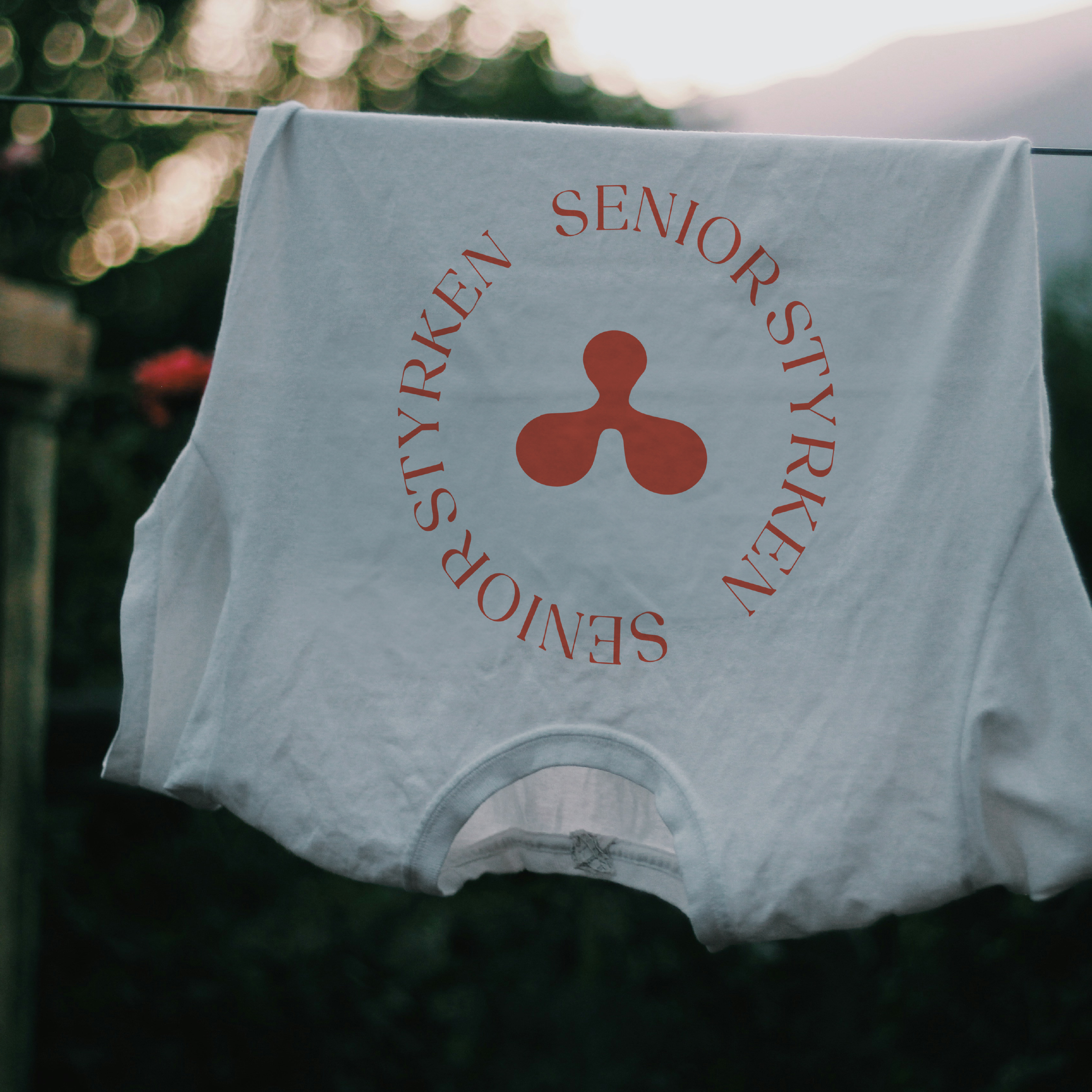
For the visuel identity to be complete, flexible and useful for the client it needed to include several logo variations, a color palette, brand fonts, image style and tone of voice. All of these elements should clearly signal that SeniorStyrken was professional yet warm and relatable.